How To Outline Text (Badly, at first)
I've recently gotten into a bit of solo dev of casual mobile games, and was surprised to learn that I have never paid much attention to fonts or their treatment. But my first prototypes often had badly aliased text and it vexed me. I was terribly vexed. So I started paying attention to what other games do.
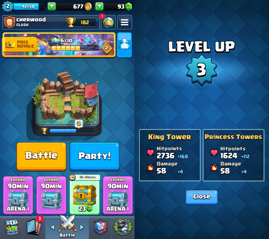
I really like the Clash Royale font. It's chunky and playful and very easy to read.
 Clash Royale's outlined text, courtesy the amazing https://interfaceingame.com/
I wanted text that looked as good as Clash Royale, so I started by commissioning two fonts, Kelblok and Kelblop. You can play with them here https://kellydornhaus.com/kelfont/ and they will be the examples I use throughout this post.
Something I never noticed is how often video games use white text with a black outline. This is also used for text on meme images, and for subtitles -- places where the text might end up on a background with any color, any brightness, any pattern.
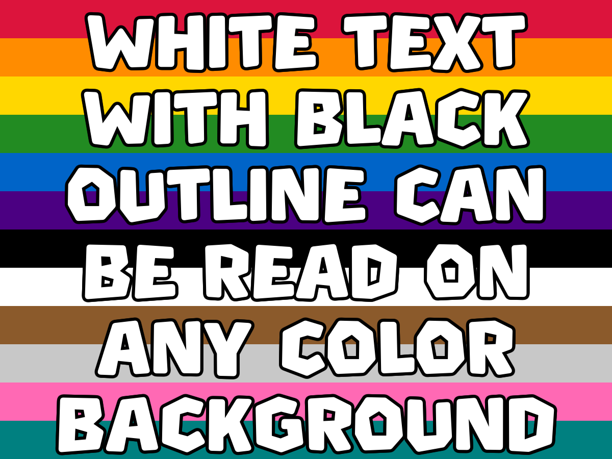 (Or brightness, or pattern)
I had no idea how to do this, so I asked my LLM-agent to do it for me. I didn't like the results. It started by drawing the text in black at an offset behind it in white, but there were jaggies. We added more offsets and got better results, but still not good enough. Eventually I got to learn about signed distance fields (SDFs).
But first: just draw it twice?
A naive idea might be to simply draw the text in black in a larger font, then in white on top of it. The LLM-agent didn't do this, but it's an idea someone might have, and I wanted to see exactly the ways it would fail.

 Draw it bigger in black, then normal size in white on top. Centered on the whole word.
This doesn't work at all because the text is scaled from the center of the text, not the center of each glyph. Edges further from the center are offset more than edges close to the center. We can try to fix this by rendering glyph-by-glyph, but the 'b' in the middle is a hint that this won't work. You can see that it has a thinner outline at the top of the curve than at the bottom, but this isn't consistent throughout the glyph s the stem is thick on top and on bottom. And it has no outline in the interior at all.
But we can try the same approach glyph-by-glyph anyway to get a better understanding of why it doesn't work.

 Same approach, but centered on each glyph individually.
I think it's just the same issue. The offset is larger the further it is from the center of the glyph. I also think that thin strokes will end up with thinner outlines and thick strokes with thicker outlines, but that's hard to see with these fonts in particular.
Stamping in multiple directions
The first thing the LLM-agent did for me was draw the text offset in each cardinal direction. This is OK but has really noticeable jaggies. If you're not used to looking closely at text and are using a phone, I recommend zooming in.

 Stamped in 4 cardinal directions (N/E/S/W).
The jaggies are most noticeable on the square edges of the fonts, where there are missing pixels in the NE, NW, SE, and SW directions. You an also see it on the outer curve of the 'p' where the stroke is slightly thinner in the NE and SE directions.
I tried more directions, first 8 and then 12, and I think it looks pretty good at 12 directions spaced equally in a circle.

 Stamped at 12 equally-spaced angles around a circle.
This is shippable to my mind, but I can still see the flaws. So I finally asked the LLM-agent to teach me something rather than just asking it to do the thing. It suggested I learn about signed distance fields.
Signed distance fields
A signed distance field (SDF) is a precomputed mapping of each pixel to its distance to the nearest edge of a glyph. It can be passed to a shader to draw an exact outline. At every pixel, you stores the signed distance to the nearest glyph edge, positive if inside the glyph and negative if outside. It's an expensive operation to create the distance field, but you only have to do it once. Store it in a texture, and then pass it off to a shader to render your text with an outline. The shader can draw black for any pixel that's outside of the glyph and within the given distance (the desired thickness) to the glyph edge.
So it's gonna look great, right?

 SDF computed from a 1× rasterization. Terrible.
Right??? Nope. Much worse. An SDF is computed from a rasterization of the font, and it's only as good as the precision of that rasterization. The above is made from an SDF built from the same size as the text itself. Instead, you should compute a high resolution SDF to get higher precision..

 SDF computed from a 4× rasterization.
At 4x resolution, I still see some flaws, but it's hard to notice.

 SDF computed from a 16× rasterization.
At 16x, I can't detect any flaws.
Thicker on the south side
Another trick up Clash Royale's sleeve is that their outline is thicker on the south side. This gives it a bit of a shadow feel.
The LLM-agent's solution to adapting the stamping method by stamping further southward exacerbates the flaws of the approach. There are probably other approaches to adapting the stamping method, but my guess is they will all exacerbate the issues. And besides, I don't really want to be rendering all pieces of text 12+ times.

 12-directional stamping with a south shadow pass.
The flaws in the NE and NW corners of the k's, for example, are more noticeable than they were before. I think the approach is still shippable, but it is worse.
The LLM-agent's for extending the SDF solution to be thicker on the southern side was to pass two distance fields to the shader (one computed as distance to the glyph and one as distance to the glyph extended southward).

 SDF with a thicker southern outline.This is exactly the result I was going for.